Way Safe
What I did in this project
- User research
- Information architecture
- UI design
- Prototyping
- Usability testing
- UI/UX Design
- 2025/26
- Group project
Way Safe is a digital awareness platform against sexual violence in public spaces, developed in a team of four for a campaign by the Ravensburg police. My focus was on the context of use, the interview with an affected person and the visual design of the Figma prototype.
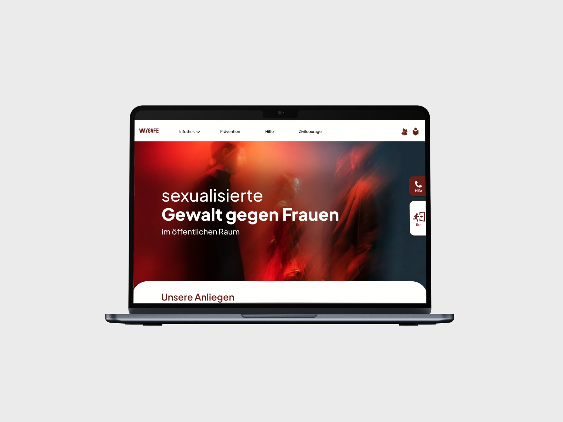
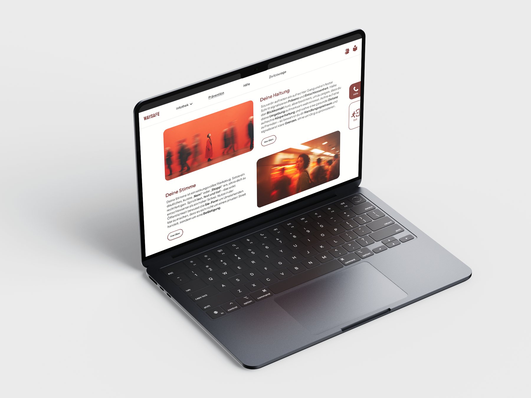
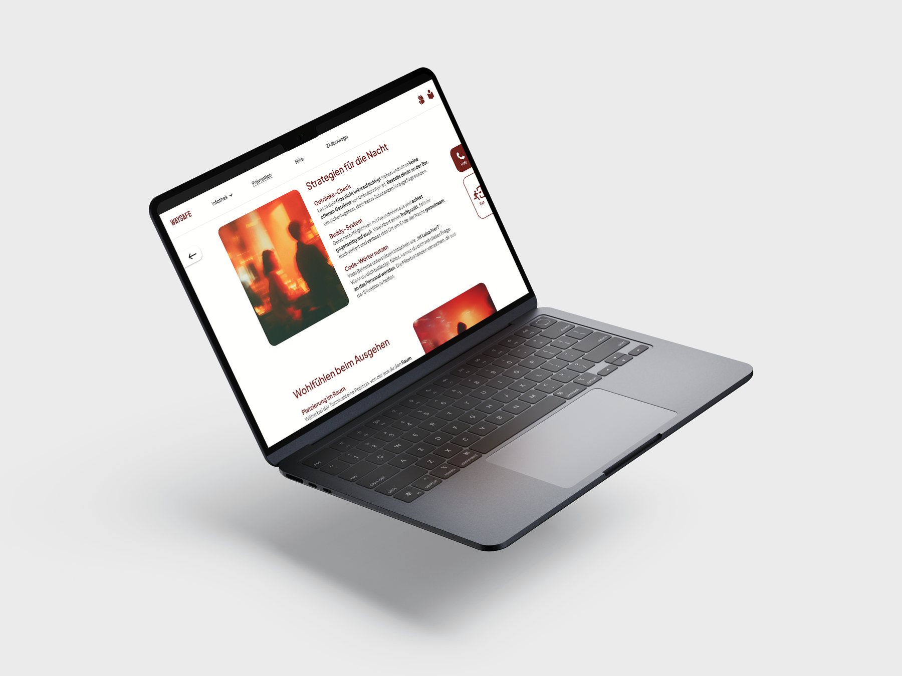
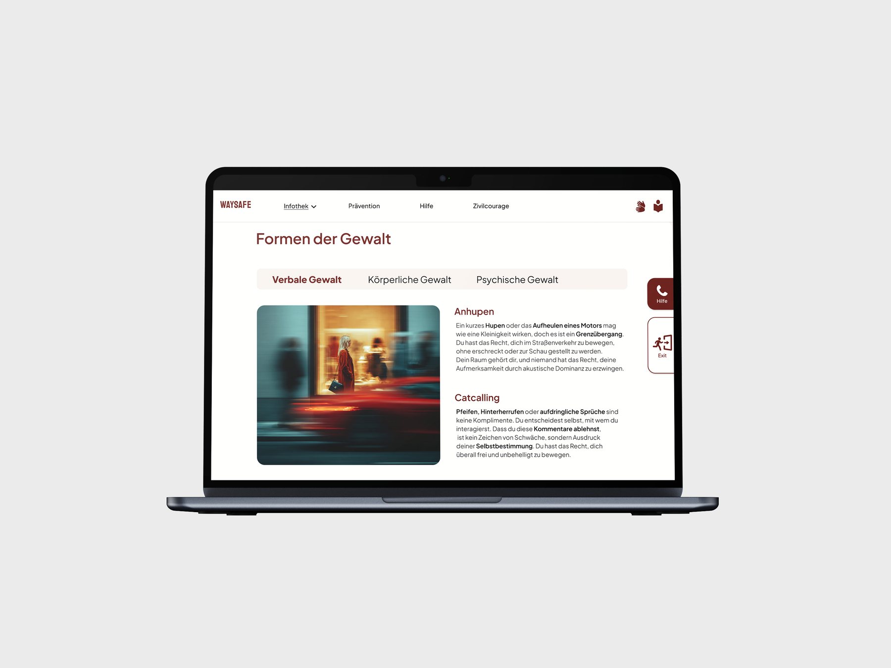
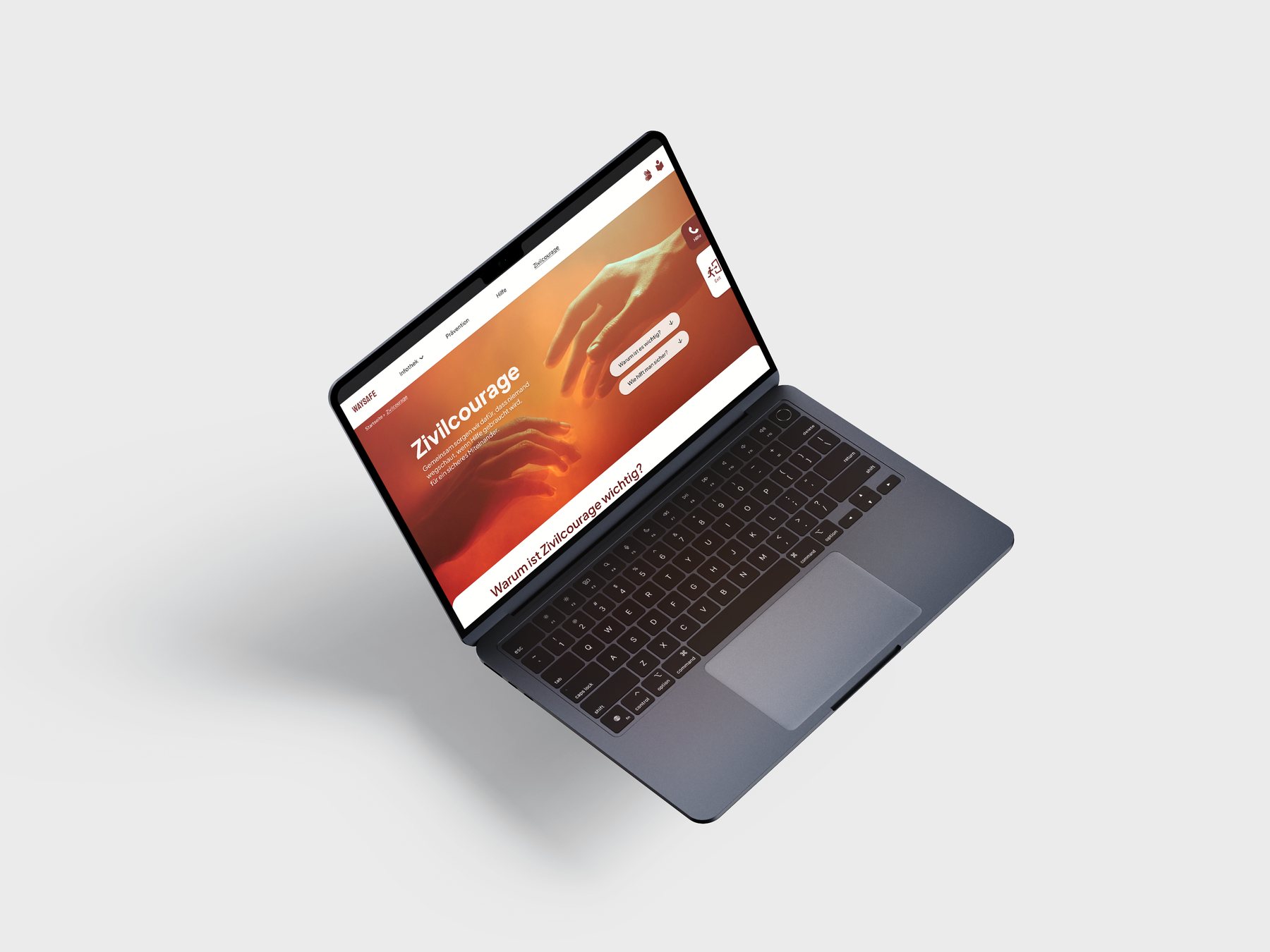
Final pages of the prototype as laptop mockups
Starting Point
86 % have already experienced
verbal harassment in
public spaces
figures in percent.
Questions included “Have you ever been a victim of verbal sexual harassment?” and “How well informed are you about support and counselling services on the topic?”
Research-Insight
Context of use
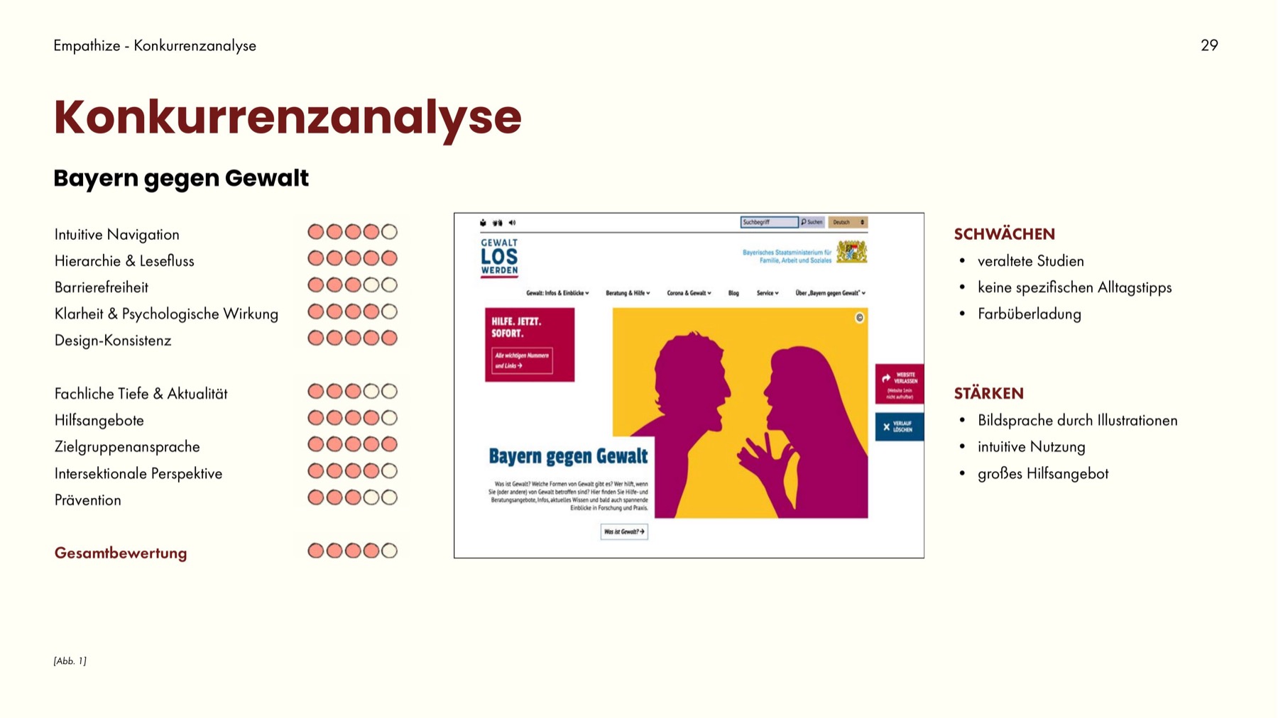
The platform is aimed primarily at girls and young women aged 16 and over who have experienced violence or feel unsafe, and secondarily at relatives, friends and professionals. Users mainly look for immediate help, prevention strategies and contacts to support organisations.
On desktop, users usually read up in peace at home, while on their smartphone they share support services with friends. Some, however, look things up secretly and only briefly, so the most important information has to be graspable at a glance.
“We don’t question what happened,
we believe.”
Competitor Analysis & Interviews
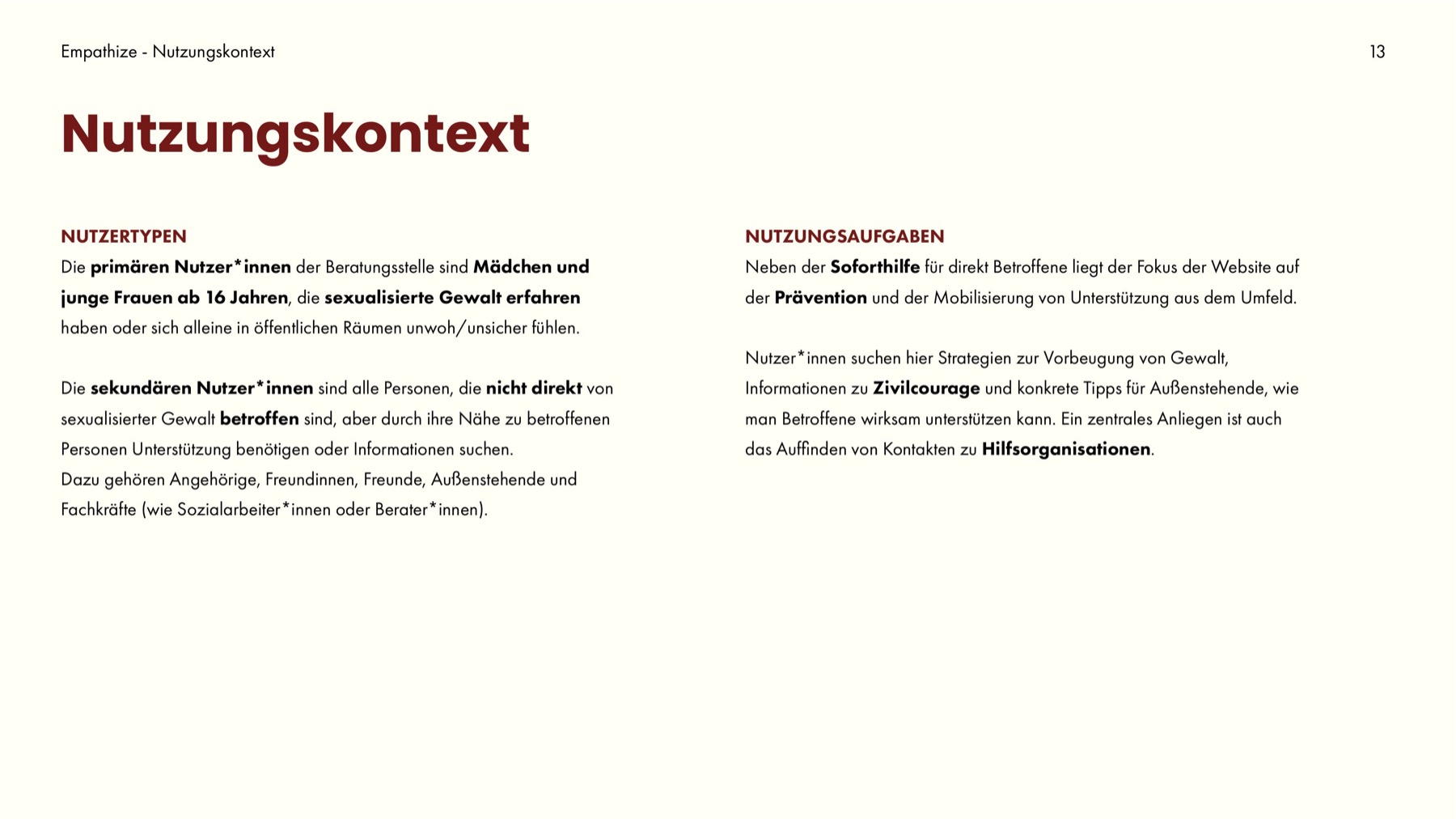
We compared five existing services using ten criteria, from accessibility to how they address their target group.
We also conducted two interviews, including one with a counsellor from Frauen und Kinder in Not e. V. in Ravensburg.
Our Goal
A platform that informs
without lecturing, and empowers
instead of frightening.
Concept
- empowering & factual
- safe & accessible
- informative & approachable
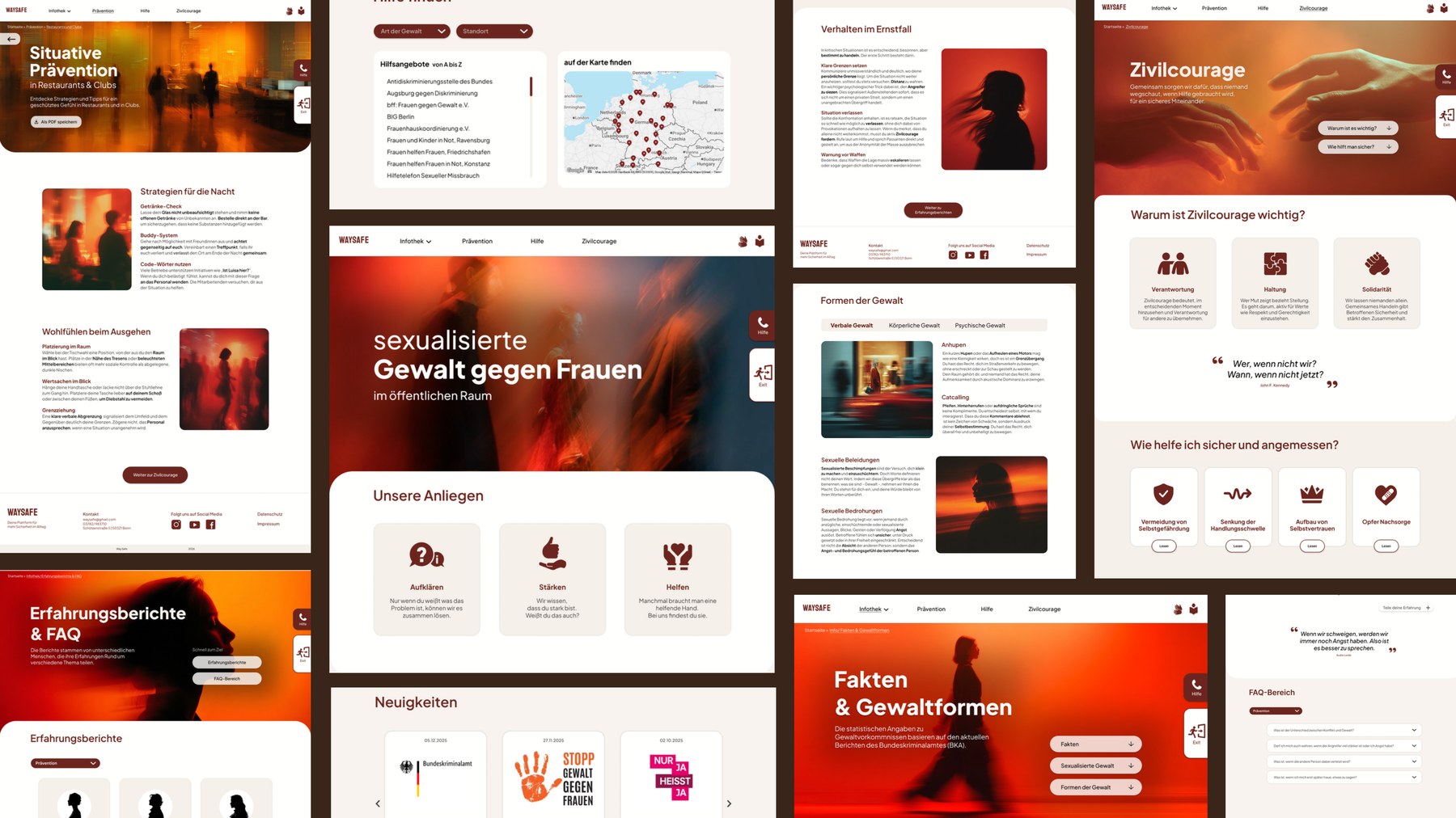
Excerpts from the final prototype, from the home page to prevention, civil courage, facts and personal stories
How It Shows in the Design
Imagery
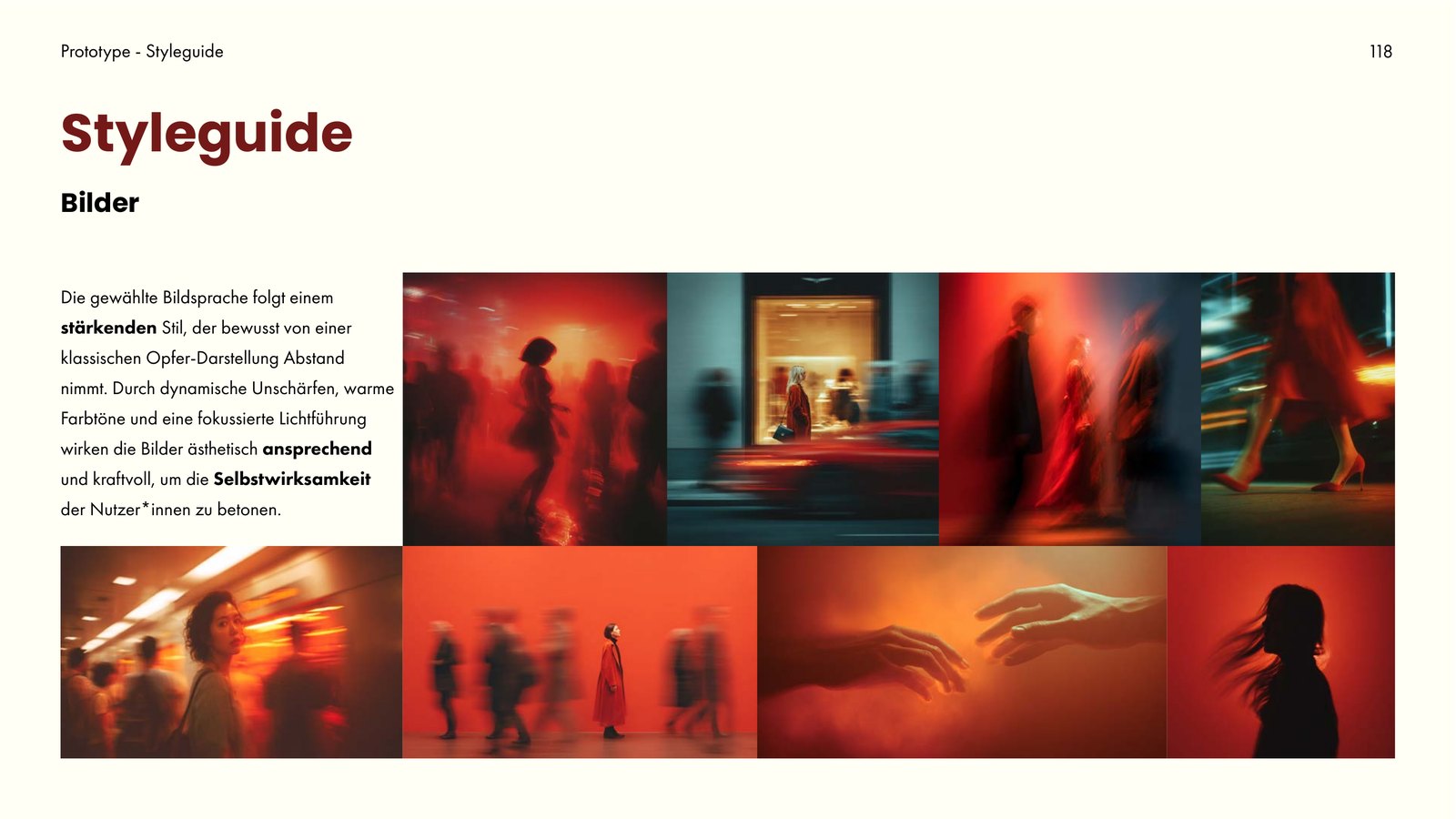
Dynamic blur, warm red tones and focused lighting to convey self-efficacy instead of threat.
Based on the interaction principles of DIN 9241-110 and the design principles of Shneiderman and Nielsen.
Safety features
A direct help button and an exit button that leaves the site immediately and clears the history were central elements from the start.
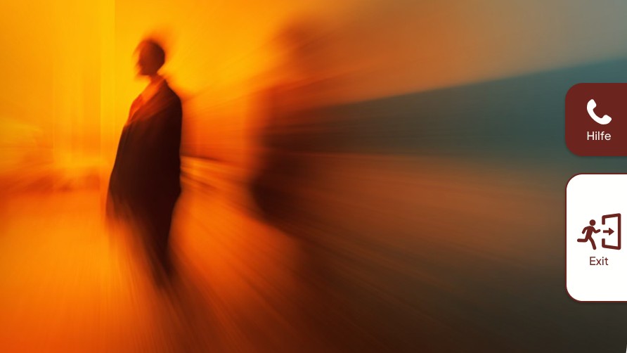
Many users need to be able to visit the site without being noticed. The exit button therefore leads straight to a neutral page without asking for confirmation. In the A/B test, the label “Exit” was better understood than the German “Ausstieg”.
Information architecture
Five clearly separated main sections, developed from nine core areas that we identified through card sorting with real users.
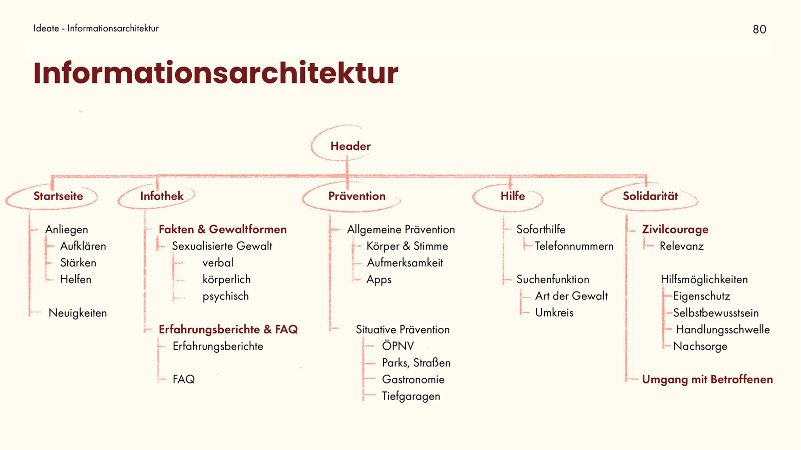
From the home page, the info hub, prevention, help and civil courage lead from awareness to immediate help.
Challenges & Solutions
Finding the personal stories
In the first think-aloud test, participants couldn’t find the personal stories because they were hidden under prevention.
A direct link button solved this, and after a second test round we placed it even more prominently.
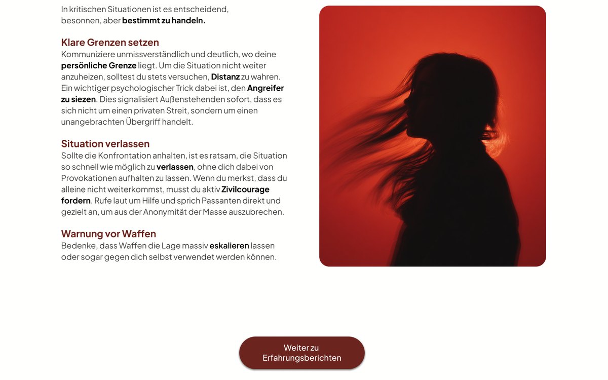
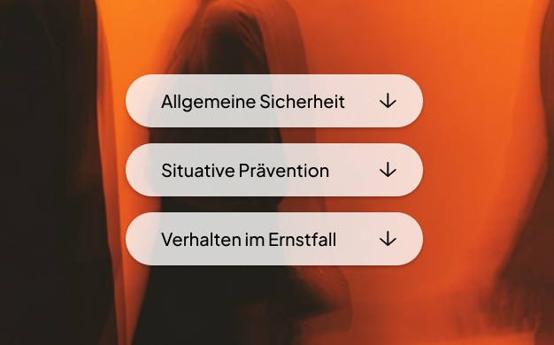
Buttons that were easy to confuse
In the final test with AttrakDiff, VisaWi and UEQ, the shortcut buttons at the top of the page were hard to tell apart from the link buttons at the bottom.
Arrow icons now make their function clear at first glance.
Learnings
Test, test, test
Testing belongs throughout the process. Only testing and several revisions showed us what we had missed as a team.
Communicate openly
Working in a team taught me to communicate regularly and openly and to raise difficult points objectively, so we find solutions everyone stands behind.
Responsibility in the details
With a sensitive topic like sexual violence, a lot of responsibility lies in details such as imagery and wording.