Sona Festival
What I did in this project
- Concept development
- Brand identity
- Visual identity
- Graphic execution
- Brand Guidelines
- Branding
- 2026
- Solo project
SONA is a complete brand concept for a fictional indie festival. The concept of energetic slowing down combines energy and calm and gives every act the same stage, from name and wordmark to colour system, icons and brand guidelines.
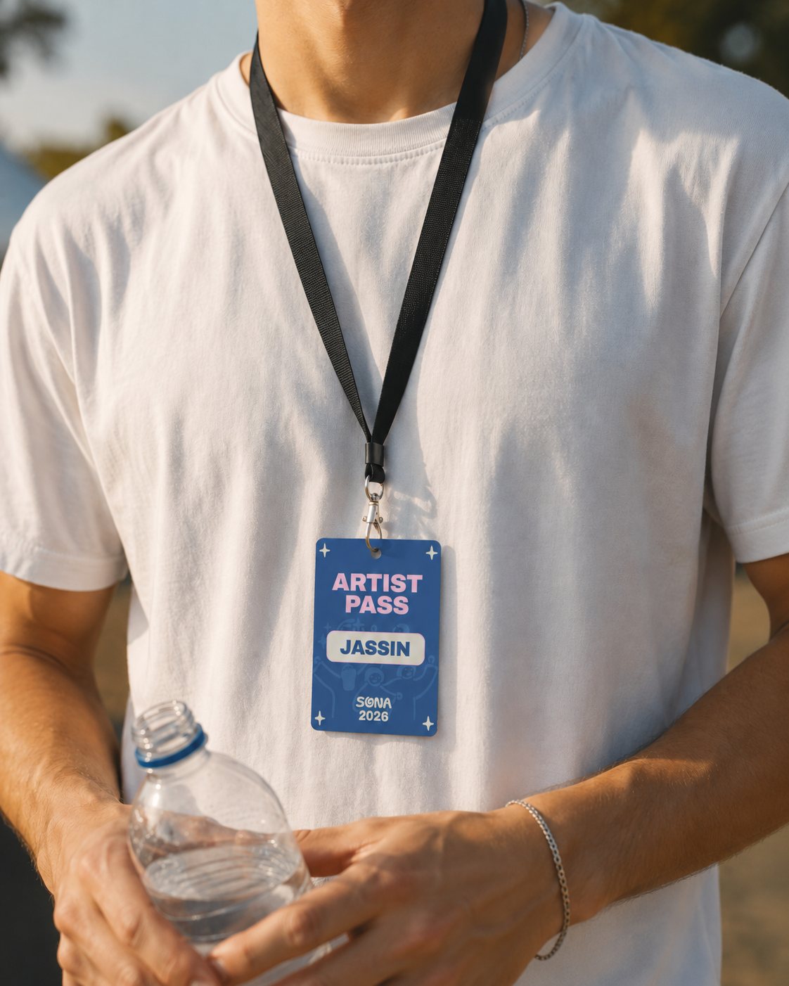
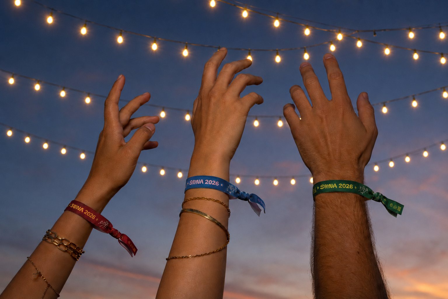
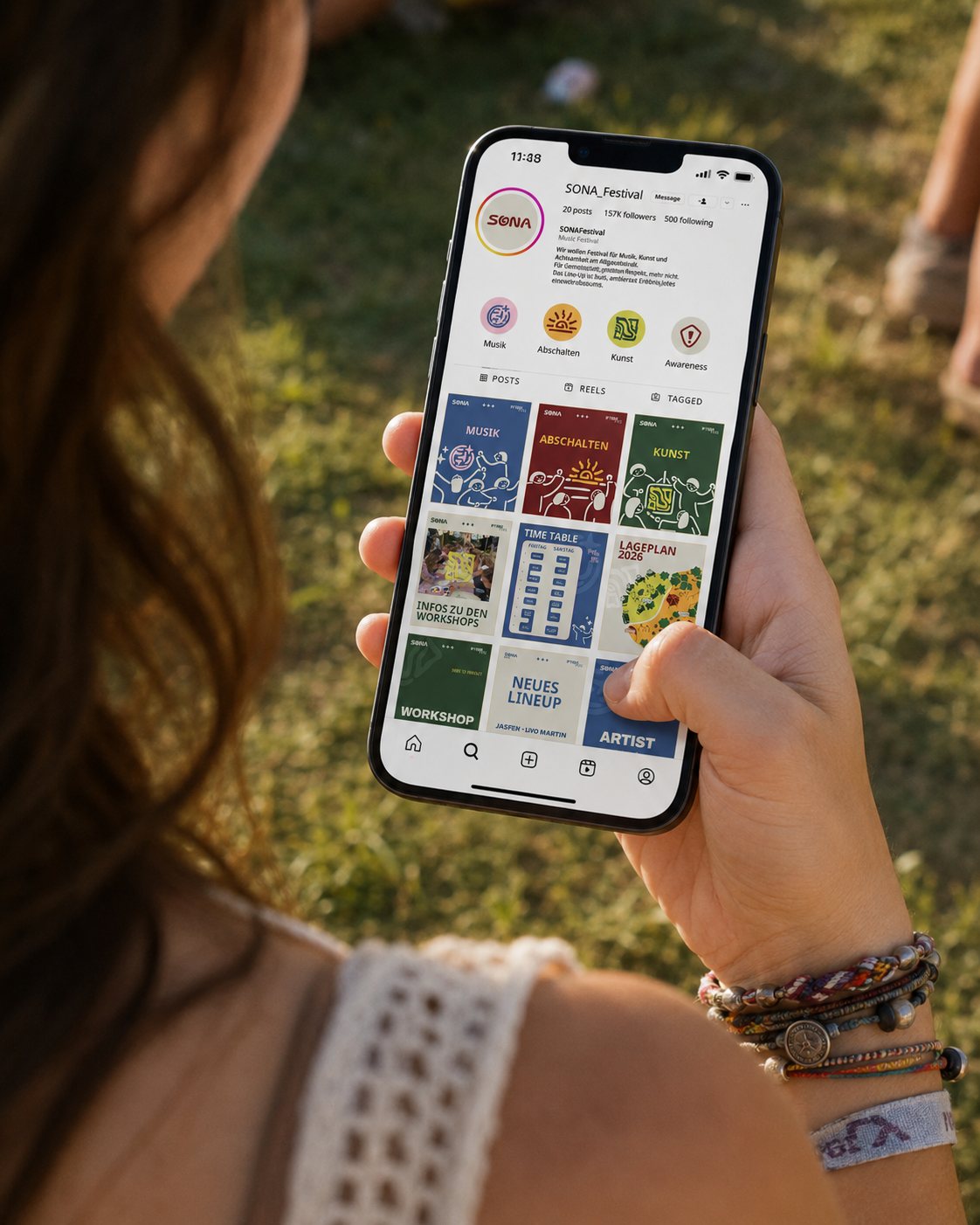
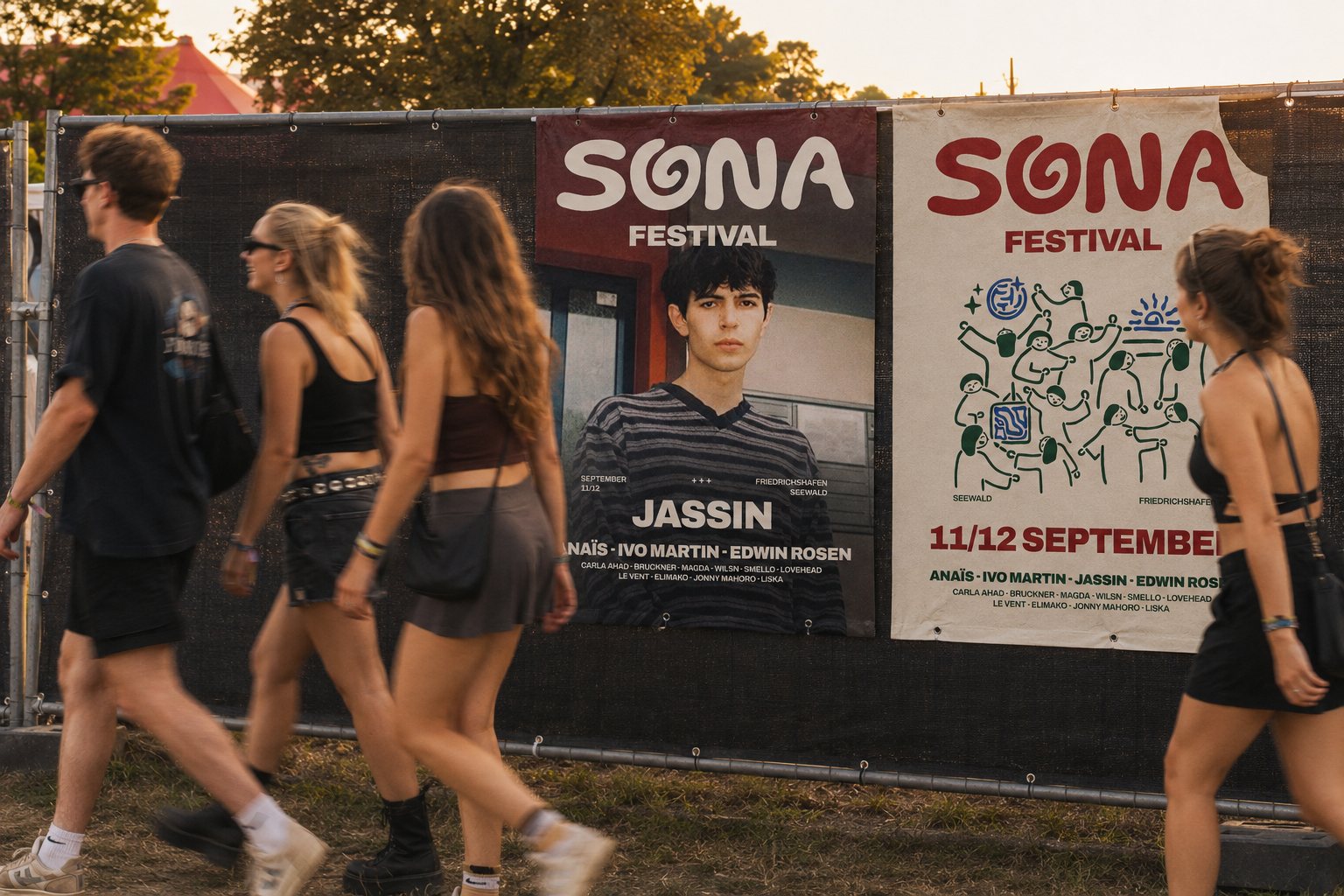
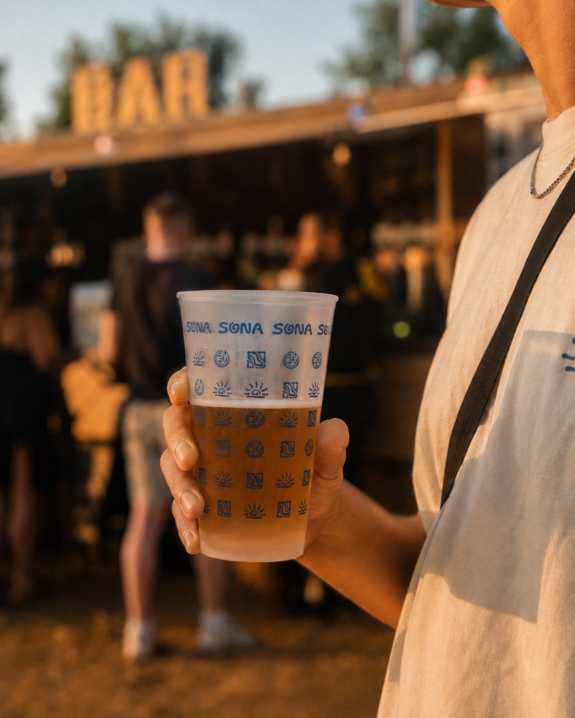
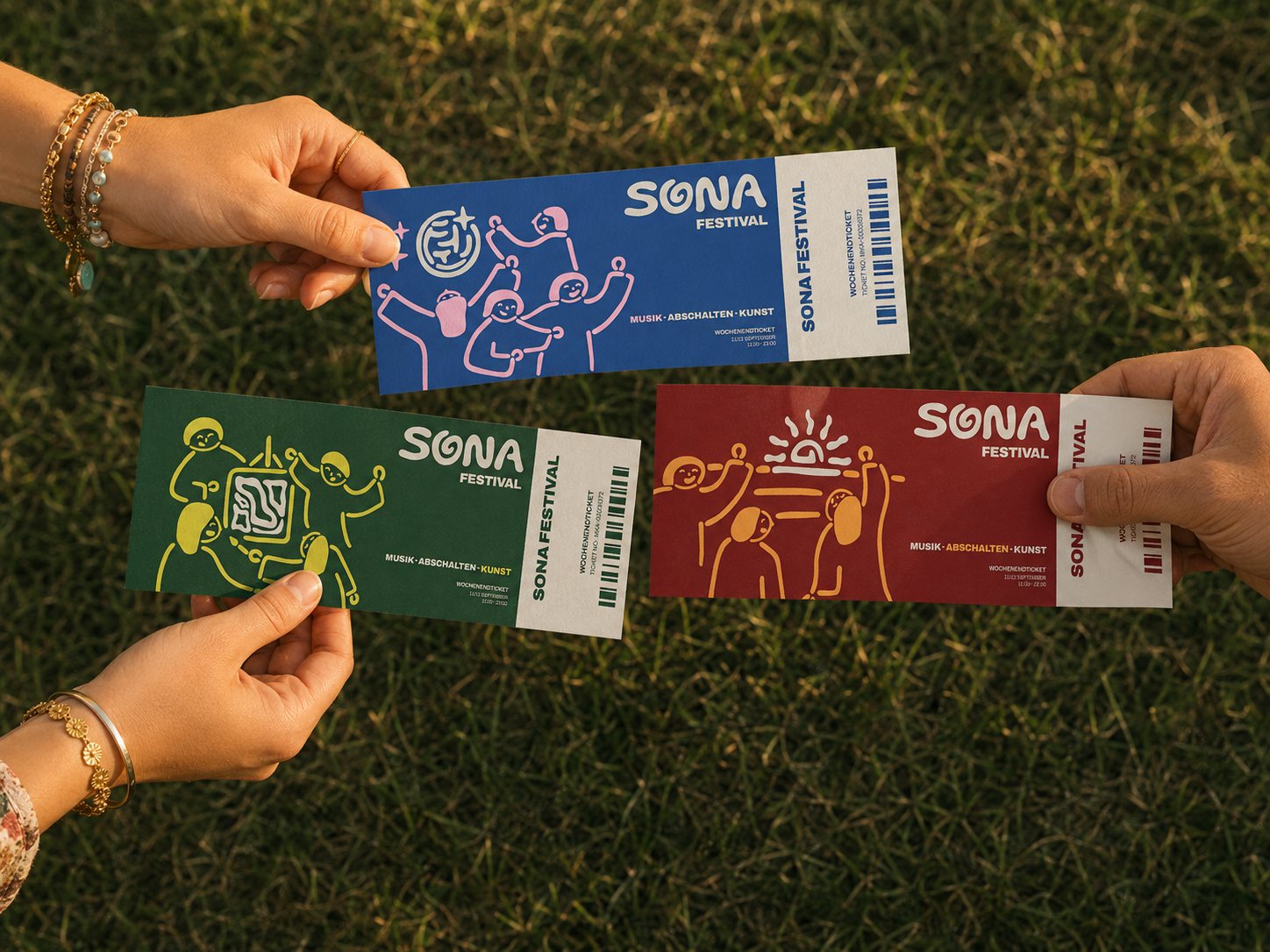
The branding in use, from the artist pass to wristbands, poster and tickets (mockups created with AI)
Starting Point
around 70 % of visitors
feel exhausted after
a festival weekend
“How do you feel after a festival is over?” (multiple answers possible)
My Vision
A place where the line
between audience and art
blurs.
Concept Development
- authentic & experimental
- approachable & exclusive
- tactile & handcrafted
Design Intent
 Music as the heartbeat
 Switching off
 Hands-on creativity
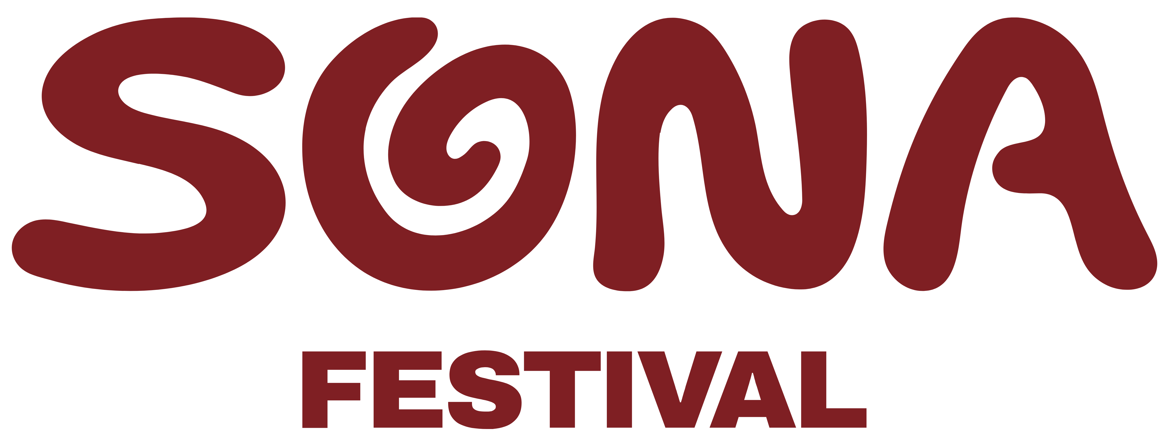

Organically drawn wordmark and the three main icons for music, slowing down and creativity
How It Shows in the Design
A two-part logo combines organic, flowing shapes with modern elements.
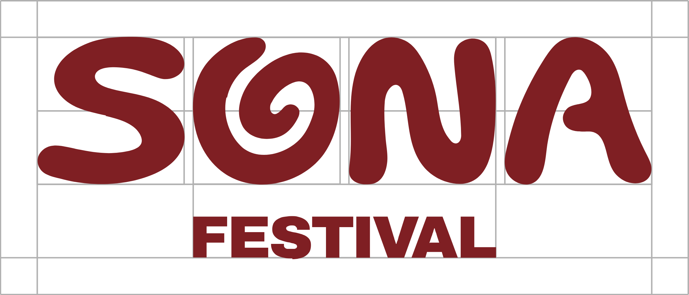
The wordmark SONA stands for the artistic side, the clean typeface of Festival for the young German indie scene.
Three hand-drawn icons pick up the flowing shapes of the logo.
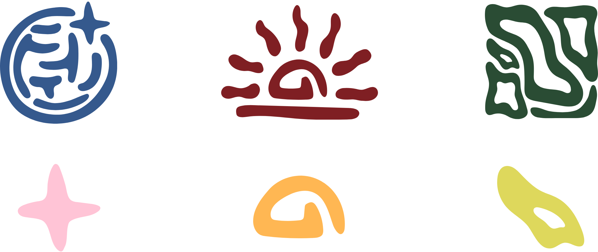
Each stands for one pillar and has a reduced version for more flexibility.
Dark, earthy base colours stand for switching off, bright accents for the art.
- Hex 35598D
- Hex FFC4D6
- Hex 2A4C34
- Hex DED85C
- Hex 7F1F23
- Hex FFB753
- Hex E2E0D3
A subtle off-white base creates calm so that accents and illustrations stand out.
Challenges & Solutions
Illustration instead of photography
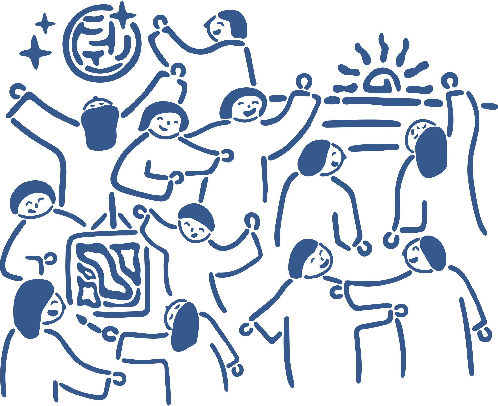
A fictional festival has no real photos, and AI photos would have looked artificial and off-brand.
Instead, a large illustration gives a glimpse of the festival and includes the three icons.
Colour system
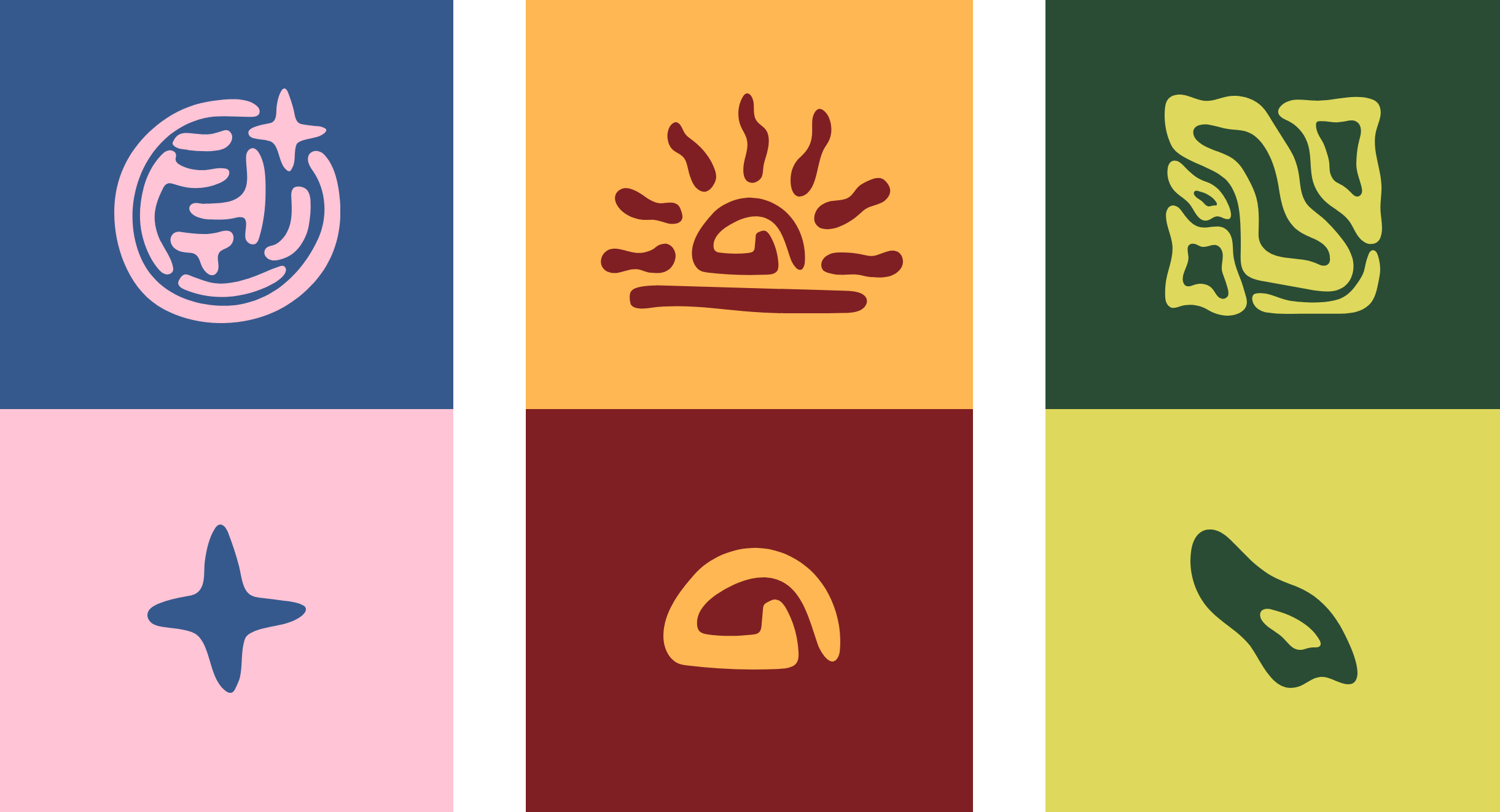
In my first drafts, the three pillars barely differed in colour, and the target group didn’t consciously notice them.
So each pillar got its own colour pair of an earthy base and a bright accent. This makes it clear at a glance what belongs where, for example in the social media feed or on the site map.
Learnings
Audience first
I learned to trust my judgement but to check it against the target group research rather than my gut feeling.
Kill your darlings
Cutting ideas and iterating several times was sometimes frustrating, but it led to a consistent brand system.
Timing is everything
As the only designer, I learned to structure a large project myself, in time and content.